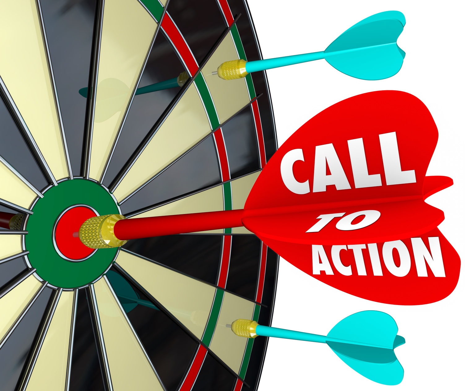
A call to action (CTA) is a vital element on your landing page that prompts visitors to take a specific action, such as signing up for a newsletter, making a purchase, or downloading a guide. It's the gateway to conversions and plays a crucial role in driving user engagement and achieving your business goals.
Before writing your call to action, clearly define the desired outcome. Whether it's to drive sales, collect leads, or encourage social shares, knowing your goal ensures that your CTA is concise and directs visitors towards a specific action.
Create a sense of urgency and compel visitors to act immediately by using strong, action-oriented words. Phrases like 'Join Now,' 'Get Started,' or 'Limited Time Offer' instill a sense of importance and motivate users to engage with your CTA.

Ensure that your call to action stands out on the page by using contrasting colors, strategic placement, and compelling design. Make it easy for visitors to spot the CTA button and understand the value they will receive by clicking on it.
Your CTA should be clear and directive—tell your visitors exactly what to do.
✅ Do This: Use power words like Get, Claim, Start, Discover, Try, Download, Book.
❌ Avoid This: Weak words like Click Here, Submit, Learn More (they don’t create urgency).
👉 Example: Instead of Sign Up, say Get Your Free Trial Today!
eople don’t just want to take action—they want to know why they should. Your CTA should highlight the value they’ll get.
✅ Do This: Clearly state the benefit (Save 20%, Gain More Customers, Build a Landing Page Fast).
❌ Avoid This: Generic CTAs that don’t communicate value (Sign Up Now).
👉 Example: Instead of Download Now, say Download Your Free SEO Checklist & Rank Higher!
You need to make people feel like they need to act right now rather than later.
✅ Do This: Use words that create urgency, like Limited Time, Last Chance, Expires Soon, Don’t Miss Out.
❌ Avoid This: CTAs that feel too passive (Check It Out When You Can).
👉 Example: Instead of Start a Free Trial, say Start Your Free Trial – Offer Ends Tonight!
✅ Do This:
People hesitate when they think there’s a risk involved. Remove their doubts by adding trust elements like:
✅ Do This:

During Barack Obama's presidential campaign, the team conducted A/B testing on their landing page CTAs to boost sign-ups and donations. By experimenting with different button texts, images, and media, they identified combinations that significantly increased conversion rates. This case underscores the importance of testing various CTA elements to determine what resonates best with the audience.
Friendbuy examined several high-performing CTAs to understand what makes them successful. Their analysis revealed that persuasive, eye-catching, and prominently placed CTAs with concise, informative language are more likely to convert potential customers. This study highlights the need for clarity and visual appeal in CTA design.
MarketingSherpa presented five before-and-after examples of CTAs, showcasing the results of their optimization efforts. These examples illustrate how small changes in wording, design, and placement can lead to significant improvements in user engagement and conversion rates. The key takeaway is that continuous testing and refinement of CTAs are crucial for maximizing their effectiveness.
Published on: Feb. 15, 2025, 8:07 p.m.
Published on: Jan. 19, 2025, 12:57 p.m.
Published on: March 8, 2025, 12:03 a.m.
Sign up today to improve your landing pages and boost your conversions!
Sign Up Now