
An unclear value proposition is like a salesperson who mumbles—visitors land on your page and, within seconds, bounce because they can’t figure out why they should care. If your offer’s benefit isn’t crystal clear (e.g., “Save 50% on your next purchase” vs. vague fluff like “We’re the best”), they won’t stick around to dig deeper. Research shows users decide in under 5 seconds whether to stay, so this confusion kills conversions fast, directly slashing revenue as potential customers vanish before engaging.
A weak or missing CTA is a guide who forgets to point the way—users arrive, browse, and leave because they don’t know what to do next. Whether it’s “Buy Now,” “Sign Up Free,” or nothing at all, a lack of clear direction stalls momentum. Studies suggest pages with strong, specific CTAs can boost conversions by double digits, while vagueness or absence hands revenue to competitors who make action effortless.
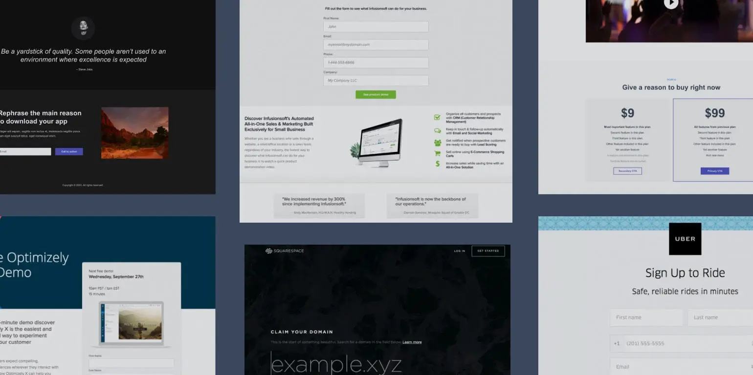
Too many CTAs turn your page into a chaotic crossroads—users freeze when faced with “Buy Now,” “Learn More,” and “Contact Us” all screaming at once. Research indicates this can slash conversions by up to 266% as decision fatigue sets in. By splitting attention, you’re not just losing clicks; you’re losing money to indecision, as visitors abandon ship rather than choose.

Slow loading speed is a slammed door—over 53% of users ditch pages that take more than 3 seconds to load, per Google’s research. In 2025, with fast internet everywhere, there’s no excuse: every second of delay hemorrhages traffic, cratering conversions and revenue. A snappy page keeps users in; a sluggish one sends them—and their wallets—elsewhere.
A cluttered design is a crowded store with no aisles—users get lost in a mess of images, text, and buttons, losing sight of your offer. Simplicity drives action, but chaos breeds distraction, spiking bounce rates and tanking conversions. Less focus means fewer sales, and that’s money left on the table as visitors flee the overload.
Poor mobile optimization is like locking out half your customers—mobile traffic dominates in 2025, yet unreadable text or broken layouts on phones can drop conversions below 1%. Users won’t pinch and zoom to buy; they’ll leave, taking their money with them. A seamless mobile experience keeps revenue flowing; a clunky one cuts it off.
No trust signals are a “buyer beware” sign—without testimonials, reviews, or SSL badges, users hesitate to share info or cash. First-time visitors especially need reassurance, and studies show trust elements can lift conversions by 20-30%. Lack them, and you’re not just losing trust; you’re losing transactions as skepticism sends revenue elsewhere.
Generic headlines are a snooze button—phrases like “Welcome” or “Our Services” don’t hook users when they’ve got seconds to care. A sharp, benefit-driven headline (e.g., “Cut Costs by 40% Today”) keeps them reading; a dull one spikes bounce rates. Lost attention means lost conversions, and that’s revenue slipping through your fingers.
Too much text is a lecture no one asked for—users skim, not study, and dense paragraphs push them away before they act. Research shows concise, scannable content lifts engagement, while verbosity buries your offer. Fewer actions equal fewer dollars, as overwhelmed visitors abandon ship rather than wade through.
Irrelevant images are a bait-and-switch—stock photos or unrelated graphics (e.g., a beach for a tech product) muddy your message and erode credibility. Users expect visuals to reinforce the offer, not distract; misalignment drops engagement and conversions. That confusion costs you sales as trust—and money—walks out the door.
Published on: Feb. 20, 2025, 11:41 p.m.
Published on: Feb. 8, 2025, 4:57 p.m.
Published on: Feb. 17, 2025, 3:41 p.m.
Sign up today to improve your landing pages and boost your conversions!
Sign Up Now